Training and Prediction Example
Import packages, create an ESN object
[1]:
import numpy as np
import matplotlib.pyplot as plt
import rescomp

esn = rescomp.ESNWrapper()
simulate some data
[2]:
simulation_time_steps = 20000
starting_point = np.array([-14.03020521, -20.88693127, 25.53545])
sim_data = rescomp.simulate_trajectory(
    sys_flag='lorenz', dt=2e-2, time_steps=simulation_time_steps,
    starting_point=starting_point)
and create the internal network
[3]:
esn.create_network()
For this example, let’s use the same number of time steps for the training as in the minimal example before
[4]:
train_sync_steps = 400
train_steps = 4000
Let’s cut the input data accordingly
[5]:
x_train = sim_data[: train_sync_steps + train_steps]
And plug it in the train() method
[6]:
esn.train(x_train=sim_data, sync_steps=train_sync_steps)
Now that the reservoir is trained, we want to predict the system evolution not directly after the training data (after 4400 time steps of simulated data) but instead sometime later. Let’s say we want to predict the evolution after 10000 time steps instead.
[7]:
shift = 10000
x_pred = sim_data[shift:]
Due to this disconnect, we must synchronize the internal reservoir states with the system again before we can use it to predict anything. Let’s again synchronize for 400 steps and predict for 500
[8]:
pred_sync_steps = 400
pred_steps = 500
y_pred, y_test = esn.predict(x_pred=x_pred, sync_steps=pred_sync_steps,
                             pred_steps=pred_steps)
Plot the prediction
[9]:
fig1 = plt.figure(figsize=(9, 6), dpi=300)
ax1 = fig1.add_subplot(1, 1, 1)
ax1.plot(y_test[:, 0],
         color='blue', label='simulation')
ax1.plot(y_pred[:, 0],
         color='orange', linestyle='--', label='prediction')

ax1.set_xlabel('time steps')
ax1.set_ylabel('x')
ax1.set_title("X-Coordinates of Simulation and Prediction")
plt.legend()
plt.show()
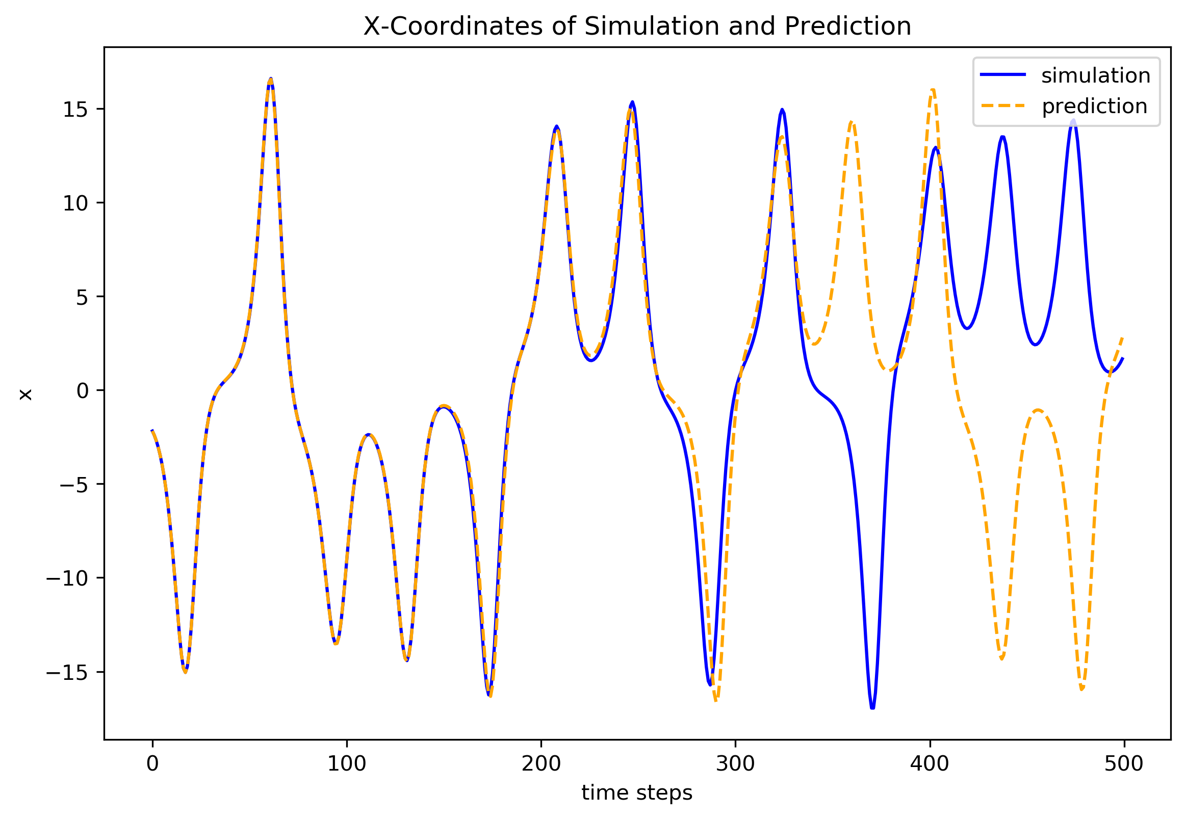
First, note that the prediction starts AFTER the synchronization, i.e. from the initial point
x_pred[pred_sync_steps + 1]
which we can prove via:
[10]:
np.array_equal(x_pred[pred_sync_steps + 1], y_test[0])
[10]:
True
This shift by 1 must always be the case as the predictions y are the reservoir output after one prediction step, which necessarily increments the time by one step:
x[t] -> RC prediction step -> y[t]
i.e. the input x[t] is used to calculate the output y[t] and hence, when comparing them to the underlying simulated data, the x-inputs and y-outputs are always shifted by this one time step:
x: |0,1,2,3,4,…]y: |-,0,1,2,3,4,…]
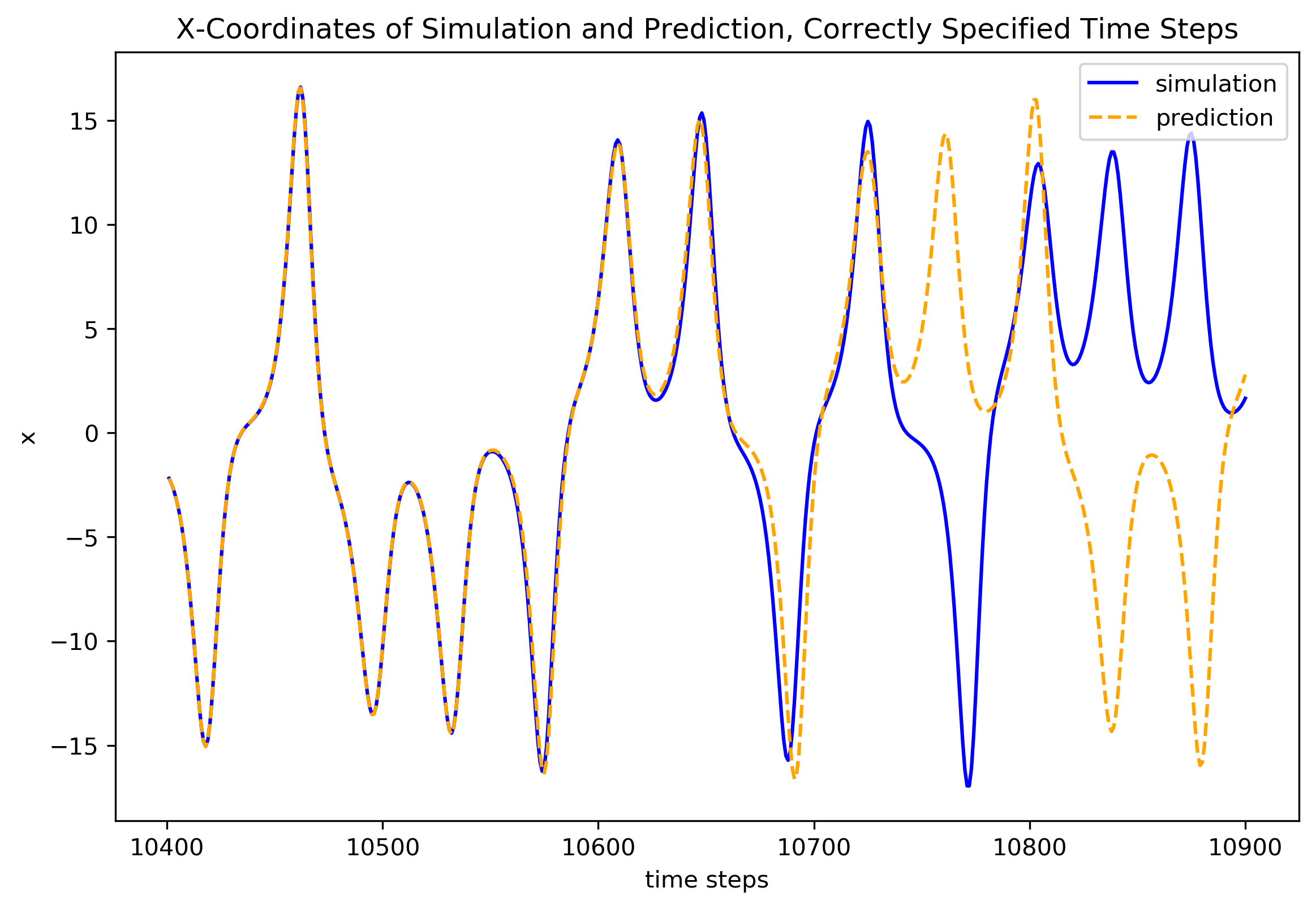
The first time step of the prediction y_pred corresponds to time step nr. shift + pred_sync_steps + 1 of the simulated data:
“shift”: the 10000 time steps we shifted the prediction input x_pred by in cell [7]“+ pred_sync_steps”: the time steps used to synchronize the reservoir before the prediction starts“+ 1”: the one time step resulting from the above explained shift of x and y by 1
Prove that this is true:
[11]:
np.array_equal(sim_data[shift + pred_sync_steps + 1], y_test[0])
[11]:
True
We can now define the correct time step range for the plot, starting at
shift + pred_sync_steps + 1
and ending at
shift + pred_sync_steps + pred_steps + 1
[12]:
time_step_range = np.arange(shift + pred_sync_steps + 1,
                            shift + pred_sync_steps + pred_steps + 1)
Now, let’s plot the prediction again, this time with the correct time steps on the axis
[13]:
fig1 = plt.figure(figsize=(9, 6), dpi=300)
ax1 = fig1.add_subplot(1, 1, 1)
ax1.plot(time_step_range, y_test[:, 0],
         color='blue', label='simulation')
ax1.plot(time_step_range, y_pred[:, 0],
         color='orange', linestyle='--', label='prediction')

ax1.set_xlabel('time steps')
ax1.set_ylabel('x')
ax1.set_title("X-Coordinates of Simulation and Prediction, "
              "Correctly Specified Time Steps")
plt.legend()
plt.show()
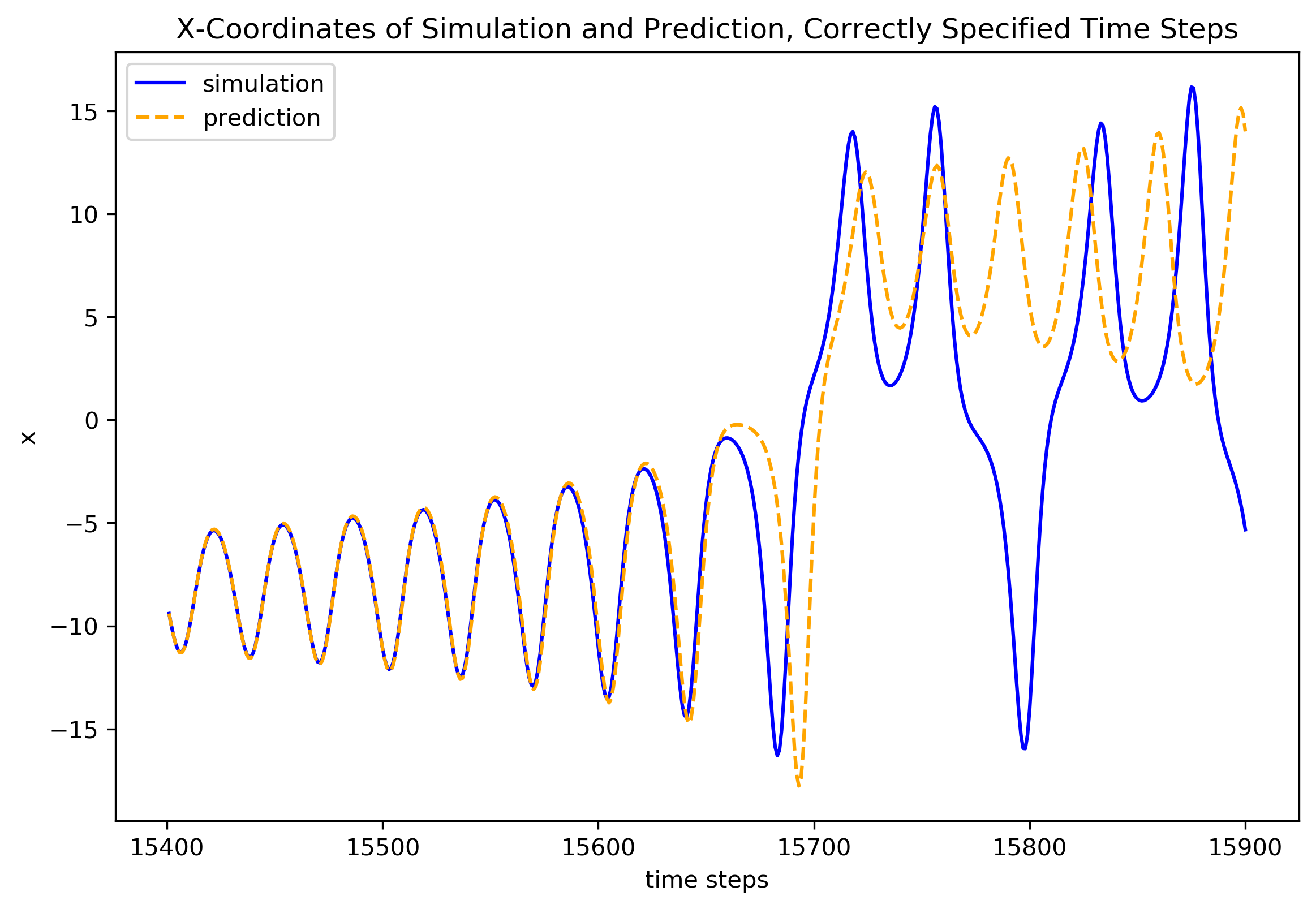
Let’s do another prediction, this time after 15000 time steps:
[14]:
shift2 = 15000
x_pred2 = sim_data[shift2:]
y_pred2, y_test2 = esn.predict(x_pred=x_pred2, sync_steps=pred_sync_steps,
                               pred_steps=pred_steps)

time_step_range2 = np.arange(shift2 + pred_sync_steps + 1,
                            shift2 + pred_sync_steps + pred_steps + 1)
Note that we do not need to re-train our reservoir if we want to predict the same system from a different starting point again. We do need to synchronize it every time though.
Plot the second prediction, again with the appropriately shifted time-step-axis.
[15]:
fig2 = plt.figure(figsize=(9, 6), dpi=300)
ax2 = fig2.add_subplot(1, 1, 1)
ax2.plot(time_step_range2, y_test2[:, 0],
         color='blue', label='simulation')
ax2.plot(time_step_range2, y_pred2[:, 0],
         color='orange', linestyle='--', label='prediction')

ax2.set_xlabel('time steps')
ax2.set_ylabel('x')
ax2.set_title("X-Coordinates of Simulation and Prediction, "
              "Correctly Specified Time Steps")
plt.legend()
plt.show()